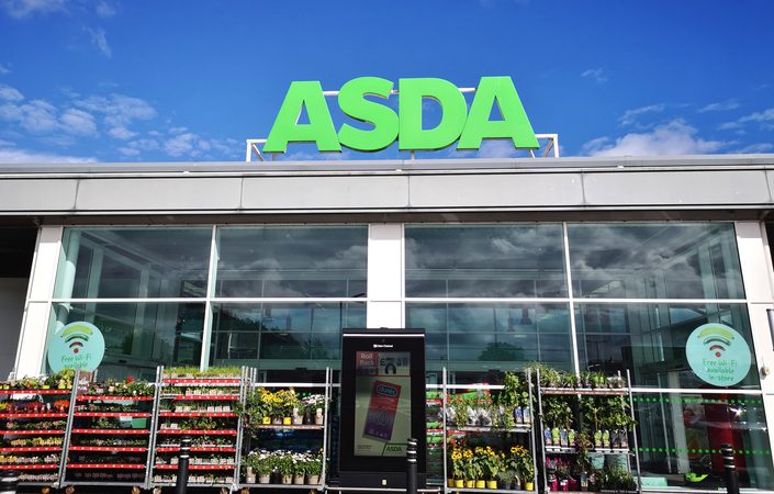
Asda’s Customer-Centric Rebranding Initiative

The British supermarket behemoth, Asda, has unveiled a transformative rebrand, marking a significant shift in its visual and corporate identity. Traditionally perceived as a value-focused retailer, Asda’s latest rebranding initiative has propelled the brand into a new echelon of sophistication. The reimagined logo, while retaining its familiar form, now sits against a backdrop of a rich, almost black, shade of green, encapsulated within an oval, sticker-like frame. This subtle yet impactful change is part of a broader strategy to refresh Asda’s market presence. The rebrand extends beyond mere aesthetics, encompassing a new typeface and colour palette, and a suite of playful stickers, alluding to the brand’s light-hearted spirit. Spearheaded by Havas London, the rebranding effort is a testament to the power of nuanced design changes in repositioning a brand within the competitive supermarket space.
The Role of Typography in Asda’s New Identity
Central to Asda’s rebrand is the innovative use of typography, a strategic move that breathes new life into the brand’s identity. In collaboration with Colophon Foundry, Havas London has crafted a bespoke, chunky, rounded all-caps font that is as distinctive as it is functional. The typeface features unicase glyphs, a typographic choice that injects a conversational and friendly tone into Asda’s messaging. This typographic flair is not merely aesthetic but serves to reinforce Asda’s approachable and warm persona, mirroring the brand’s northern humour. The new font is versatile, designed to stand out across various media channels, ensuring Asda’s voice remains consistent and engaging. The rebrand thus showcases how typography can be a powerful tool in shaping a brand’s character, making Asda’s communications more personable and relatable to its vast customer base.
Asda’s Creative Partner: Havas London’s Strategy
Havas London, the creative force behind Asda’s rebrand, has meticulously crafted a strategy that reflects the evolving landscape of brand interaction. Lorenzo Fruzza, Havas London’s Chief Design Officer, emphasises the importance of recognising the diverse channels through which brands engage with their audiences today. The agency’s approach was to forge an identity for Asda that could effortlessly adapt across traditional and modern media platforms, ensuring relevance and resonance with consumers. This strategic vision was brought to life through a comprehensive audit and exploration of Asda’s brand, leading to the creation of a typographic direction that encapsulates Asda’s personality. The result is a brand identity that stands out in the saturated grocery market, one that is not only clear and modern but also embodies the uncompromising value promise Asda makes to its customers, a testament to Havas London’s forward-thinking strategy.
The ‘Serious About Summer’ Campaign and Conversational Tone
Asda’s rebranding crescendos with the ‘Serious About Summer’ campaign, a vibrant celebration of the season’s joys and the supermarket’s refreshed identity. Directed by Freddie Waters of Pulse, the campaign’s advertisements encapsulate quintessential summer experiences, underpinned by the new ‘Asda, that’s more like it’ strapline. This campaign is a strategic move to solidify Asda’s position in the market, showcasing its commitment to quality and value while highlighting the brand’s playful side. The conversational tone, a hallmark of the new brand identity, is evident throughout the campaign, resonating with the public through relatable scenarios and light-hearted humour. David Hills, Asda’s Chief Customer Officer, articulates the objective to reignite the strong emotional connection customers have with the Asda brand, a connection that the campaign’s convivial tone and engaging content are poised to strengthen.
Customer-Centric Approach and Market Differentiation
Asda’s rebranding initiative is deeply rooted in a customer-centric approach, with the aim of creating a clear, modern identity that resonates with consumers. The new brand identity, developed with customer feedback at its core, is a strategic move to differentiate Asda in the competitive grocery market. By pairing the iconic green with a refreshed logo, colour palette, and new typography, Asda has crafted a narrative of ‘uncompromising value’ that speaks directly to the consumer’s desire for quality and affordability. This narrative is further reinforced by the brand’s expansion into convenience and food service, showcasing a commitment to meeting customer needs. The rebranding is not just a visual overhaul but a reassertion of Asda’s heritage and future aspirations, designed to stand out and rekindle the strong connection customers have historically felt towards the brand, thus setting Asda apart from its market competitors.


